ALWAYS CONSULT YOUR INVESTMENT PROFESSIONAL BEFORE MAKING ANY INVESTMENT DECISION

April 17, 2022 | More on the Yield Curve and Helping Ukraine

John Mauldin


It’s Easter weekend, so we are going to revisit a 2018 letter about the yield curve. The yield curve is much misunderstood and misused by many analysts. This letter will give you the tools to understand the correct importance and relevance of the yield curve. And then, a few comments about Ukraine.
First, a reminder it’s just over two weeks until the beginning of the SIC 2022! I hope you’re as excited as I am. If you haven’t ordered your Virtual Pass yet, I suggest you do so now.
We have over 50 speakers now, including big names like Joe Lonsdale (Palantir), Cathie Wood (ARK Invest), Ron and Michael Baron (Baron Funds), Ross Perot Jr., Niall Ferguson, Tom Hoenig (formerly FDIC and Kansas City Fed), strategist and pollster Frank Luntz, and many more. We’re also working on a special surprise guest whom I can’t tell you about yet, but suffice it to say, every American knows his name.
If you want to know where US inflation and the Russia-Ukraine war are going, where to find hidden gems to invest in right now, or what the Fed will likely do next, you should join us from May 2–13 (on six alternating days). Even if you can’t watch live all six days, every presentation and panel session will be recorded for you and made available after the conference, together with transcripts and presenter slides (as available). Click here to get your Virtual Pass now.
I wrote the following in December 2018, originally titled The Misunderstood Flattening Yield Curve. Some of it is out of date now but still informative. I’ve added a few new comments in [brackets]. With that, let’s jump right in.
***
Everybody is suddenly talking about the inverted yield curve. They’re right to do so, too, but alarm bells may be premature. Inversion is a historically reliable but early recession indicator. The yield curve isn’t saying recession is imminent, even if it were fully inverted, which it is not.
What we see now is really more of a flattened yield curve, with a smaller but still positive spread between short-term and long-term interest rates. That’s not normal, but it’s also not a recession guarantee. However, when we combine this with assorted other events, it adds to the concerns.
I’ve been writing in this letter about the negative yield curve since 2000 when the inverted yield curve said there was a recession in our future, and I called a bear market in equities. Ditto for 2006, though at that time, the yield curve inverted long before the stock market turned. Today, we’ll look at what the yield curve is really telling us.
Breathless Reporting
In July 2017, I wrote a letter called Happiness Is a Normal Yield Curve, and now it seems like about 10 years ago. The Fed was still in tightening mode at that point, and short-term rates were rising faster than long-term rates, producing a flatter but not inverted yield curve.
(Quick explanation for the uninitiated: The yield curve is simply a graph showing current interest rates for various maturity periods, with rates on the vertical axis and time on the horizontal. Normally it slopes upward from left to right. All the discussion and drama are about the angle of that line.)
Here is the latest view, via GuruFocus.
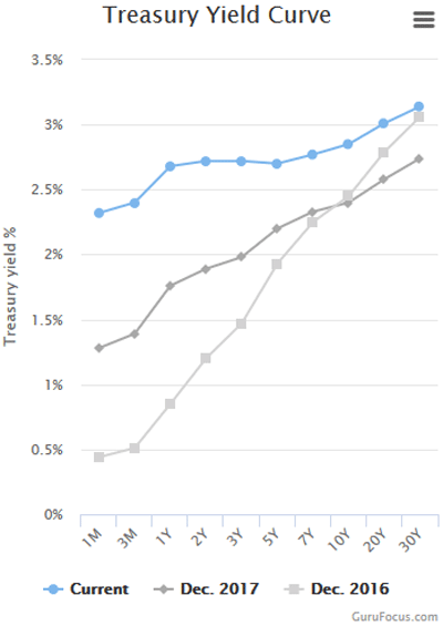
The light gray line is the yield curve [in 2016], the medium gray is [from 2017], and the blue is [from 2018]. You can see the curve went from very steep to much less so in this period. That is what we mean by “flattening.” It isn’t fully flat yet but is moving in that direction.
Notice also in the blue line, the area between 3Y and 5Y actually angles slightly downward. That is the “inversion” the media is reporting so breathlessly. It is really more of a bump, if that. As I write, the 3Y is actually 2.84% and the 5Y is 2.83%. So the mainstream media, business media, and writers are getting all breathless about 0.01% on just one part of the curve. This is kind of, sort of important to watch, but it doesn’t really mean anything in terms of the economy, at least not yet.
That said, it is still remarkable that 1-year Treasury and 5-year Treasury securities, and everything in between, all have almost exactly the same yields. You don’t see any such plateau in the 2016 or 2017 curves.
For the record, here’s a chart of interest rates for the last two weeks directly from the US Treasury. What you can notice is the fact that short-term rates are rising and long-term rates are falling. This is what you would see ahead of a full inversion, but the process can go on for a long time.
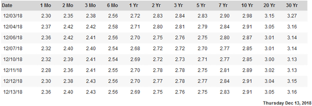
Source: US Treasury
Yields are supposed to reflect risk, and risk grows with time. The chance something bad will happen in the next five years is higher than the chance something equally bad will happen in the next year. Lenders, i.e., bond investors, should demand a higher yield as compensation for that higher risk. Presently they aren’t.
I show all this to clarify a point the media is obscuring: The full yield curve is not inverted. Only a small part of it is inverted, which is unusual, but no reason to panic. It is nowhere near the kind of inversion that might signal recession. And even if it were, it wouldn’t mean recession is right around the corner.
[But let’s look at today. From about 15 months to 30-year bonds, the yield curve is inverted. If Powell does what he says he will, then a few meetings from now with 50 basis point hikes, we will begin to see a full yield curve inversion. What does that mean?]
An Inverted Yield Curve Is Just a Fever
I’ve been using an analogy in my speeches recently that has received excellent feedback, so I want to share it with you. Many media sources and writers seem to indicate that an inverted yield curve causes recession. That is simply not true.
Think of an inverted yield curve as a fever. When your body gets a fever, the fever is not the cause of the sickness. It just says something’s wrong with your body. You have the flu, appendicitis, or some other ailment. The fever indicates you are sick but not necessarily what the sickness is. And typically, the higher the fever, the more serious the condition.
It is the same with the yield curve. The more inverted the yield curve is and the longer it stays that way, the more confident we are that something is economically wrong that may show up as a recession sometime in the future. More on that timing below.
Early Predictor
In a true inversion, we would see the entire curve angled down from left to right. That last happened in 2005. Were we in recession then? No, not at all. The economy was booming. In fact, the yield curve stayed inverted until mid-2007. Some of us saw cracks forming in the economy and said so at the time. But the actual recession would not begin until December 2007.
That’s a longstanding pattern. The inverted yield curve has been a pretty reliable recession indicator, but it shows up far in advance—months or even more than a year. We might better think of it as signaling the cycle’s “blowout” stage. People see the inversion, observe nothing bad happening, then throw caution to the wind.
Another way to illustrate this is with a yield spread, i.e., a long-term yield minus a short-term yield. You can graph the difference, and it goes below zero when the short-term yield is higher, meaning an inversion exists between those two points on the yield curve. This chart shows the spread between 10-year and one-year Treasury yields.
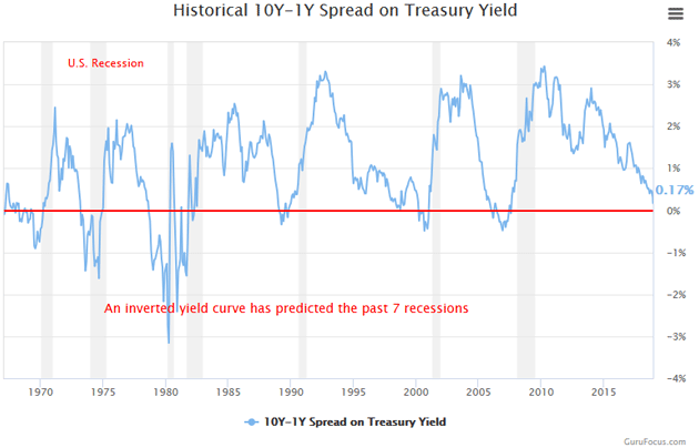
Source: GuruFocus
The gray vertical bars are recessions. You can see how the spread dropped below the 0% line right before each one and is now close to that point again. But notice also how long it stayed inverted before the last recession and how far in advance. The 10Y–1Y spread dropped below zero in January 2006, came back above for a little bit, stayed there, and was moving higher when the recession finally began. The same happened in 2000. In fact, by the time the actual recession arrives, the yield curve can resume a normal pattern.
Here’s a slightly different chart from FRED (the St. Louis Federal Reserve all things economic database), using the 10Y–2Y yields. This is the “tens and twos” spread traders usually watch.
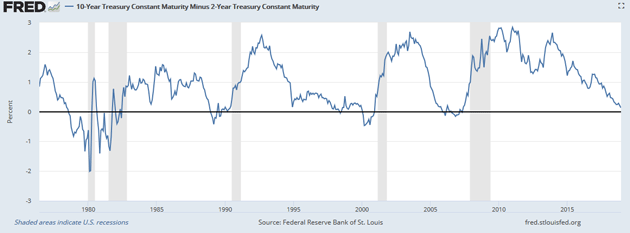
Source: FRED
We again see the same pattern. You can vary the parameters, but the broad principle holds pretty well. Yield curve inversions precede recessions by anywhere from a few months up to two years.
Recession Probability
This awareness that an inverted yield curve signals recession isn’t new, nor did it appear from thin air. My first economic mentor, Dr. Gary North, taught me about inverted yield curves in the early 1980s. To my knowledge, there was no real research, just anecdotal observational analysis, but it still held. Then my friend and economist Campbell Harvey, now at Duke University, first proved its forecasting accuracy in his 1986 University of Chicago doctoral dissertation. Others quickly confirmed and expanded on his conclusions.
In 1996, New York Fed economists Arturo Estrella and Frederic S. Mishkin authored a paper comparing the yield curve to 19 other indicators and, importantly, finding a connection between the yield spread and recession probability.
To summarize, Estrella and Mishkin found the yield curve is most predictive of recession a year or so ahead of time. In fact, they concluded an inverted yield curve was the only useful predictor of recessions. Examining all the data from 1960–1995, they calculated the probability a recession would occur four quarters ahead, based on the spread between three-month and 10-year Treasury securities. They summarized it in this table.
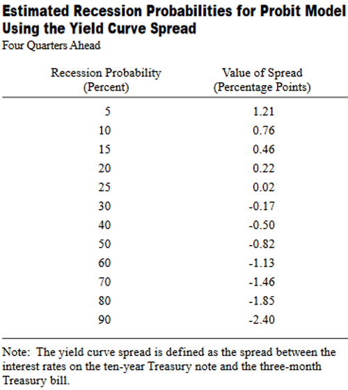
Source: New York Federal Reserve Bank
Again, the yield curve is inverted when the spread is negative. Estrella and Mishkin found recession probability begins rising as the spread drops toward and then below zero. But notice how long it takes. Even when the curve mildly inverts with the spread at -0.17%, the odds of a recession in the next year are still only 30%.
But from a practical standpoint, by the time their model shows a 30% or 40% probability of recession, there has always been a recession following that point.
Your next question, of course, is where are we now. The 3M/10Y spread is about 0.48%. [Today is 1.5% but skewed by Fed policy.] The table suggests this is consistent with about a 15% recession probability four quarters from now. [Again, the table would suggest no recession in our future, which is not my current call.] Not so bad if you are a bull. It means odds are good we’ll get through 2019 without recession. Maybe longer if the Fed pauses tightening next year and long-term yields stay where they are.
We are not out of the woods, though. We may just be entering them. Here is the 3M/10Y spread, the one Estrella and Mishkin used in their study since the last recession ended.
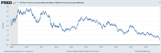
Source: FRED
The spread peaked almost coincidently with the last recession’s end (the gray area at left) and has been dropping ever since. The ride down was smoother since mid-2017. Another two years like the last two will put the spread around -1.0%, meaning a recession is likely in 2020. The decline could also steepen and bring recession sooner.
After they wrote this paper, Mishkin went on to be a Fed Governor from 2006–2008 and is now at Columbia University. Estrella is still at the New York Fed and has been keeping these numbers updated. Here’s his latest chart showing recession probability.
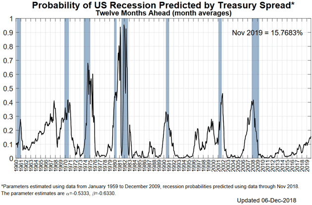
Source: New York Fed
As you see in the lower right of the chart, recession probability has been rising and is now around 15%, consistent with their earlier work. It is not rising as quickly as it did ahead of the last recession.
A little history: In September 2000, the yield curve was seriously inverting. I called Estrella to talk about the importance of the curve. I wrote then:
First, he told me he had done another study in 1998 comparing even more predictors. The latest study involved 30 potential predictors of a recession. The conclusion of that study was that the 90-day average of the yield curve was still the most reliable predictor of the 30 they studied, so score one for taking this current situation more seriously.
But he would not go so far as to say that he personally saw a recession coming. I would like to consign that reluctance to the fact that he was still at the Fed.
In 2006, I called another Fed researcher and asked about recession probability. Again, there was great reluctance to actually predict a recession. This Federal Reserve economist actually went so far as to say (I swear, the person really said this): “There are reasons to believe it may be different this time.”
Later in 2006, I was on my friend Larry Kudlow’s CNBC show with Nouriel Roubini and John Rutledge. Larry and John were both adamant the bull market was in no way over, and no recession was on the horizon. Nouriel and I saw it different. Oddly, we were all correct.
How can that be, you ask? A bear market began about six months after the show, and recession six months later. But the stock market rose almost 20% after that show as well, so if you had exited the stock market, you would’ve missed a 20% rise (but still avoided a 50% bear market).
Sidebar: That has now happened to me twice. I’ve called recessions early and missed some opportunities. That is one of the reasons that I now use money managers with quantitative timing models. At the beginning of 2017, the four managers I use were heavily invested in equities. This year, they have slowly moved into cash and are now, as a group, holding a significant portion (over 70%) of cash and cash equivalents. But then again, their models could become bullish. I have come to the point that I simply trust their models. For me, it feels a lot better than trying to make a prediction based upon my own analysis.
I haven’t found a way to predict the future accurately, and certainly not with anything close to precision timing. And so, while I can watch the yield curve and begin to get an idea of when there might be a recession in our future, applying that in a portfolio is difficult at best.
A Little Time
So pulling all this together, the flattening yield curve is a fair bit away from signaling a recession in the next year. That could change, but it’s where we are now. But it is certainly something to watch.
On the other hand, history never repeats itself quite so perfectly. Other things are different—all the European Threats I described last week or the prospect of wider trade war as President Trump tries to make China change its ways.
I would not conclude from the yield curve that recession is either imminent or impossible. It says what I already knew: A recession will strike at some point, but we probably have a little time. I suggest using that time to prepare. As I’ve been saying for the last few months, you should prepare to exit positions that may become illiquid, think of ways to hedge, and generally get ready for a volatile 2019. Think of cash as an option on the future.
The high-yield bond market is also illustrative. Here is a chart from a webinar I just did with Steve Blumenthal.
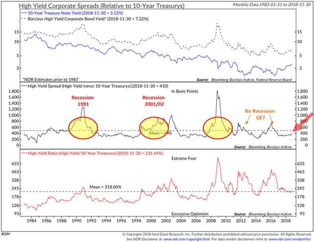
Steve has been timing high-yield bond markets since 1992. I was actually timing high-yield bond markets for clients in the early 2000s when Steve and I met, and I realized his system was better than mine. He’s had three incredible runs since then in which he exited high-yield bonds, and then his quantitative system said to get back in. He will tell you that he was extremely nervous every time, but he did what the model told him to do.
Extraordinary gains followed because as rates fell, the bonds delivered both high yields and capital gains. Steve feels a similar opportunity is coming. But you’ll need some cash to participate when that time arrives.
I think we’ll see a host of opportunities at the bottom of the next recession. Seizing them will take an iron stomach, but it’s at the bottom of the markets, when everybody else is panicking, that you find real life-changing opportunities. While cash may seem unattractive today, it is really an option for future opportunities.
Helping Refugees in Ukraine
Back in 2022 now. Two weeks ago, I asked you to donate to the Jesuit refugee services helping women and children in Ukraine find homes in Poland and Europe. Your generosity was overwhelming. We raised almost $100,000 from that link.
It turns out the local Jesuit university can directly fund the Jesuit Refugee Service in Poland. (I have met the priest who runs the local Jesuit high school. These are the good guys.) They have organized buses to pick up refugees and bring them 15 miles into Poland, where services are set up to handle them. This bypasses human traffickers and other pond scum at the border crossings, some of whom offer transportation for thousands of dollars. The Jesuits and their volunteers do it for free.
Your generosity means there are now seven additional large buses going into Ukraine and delivering refugees directly to Krakow. Almost 500 refugees are moving every day, and other donors have partnered with Airbnb to find rooms all over Europe.
One of my good friends and neighbors, Hank Holland, was in Ukraine at the time, assessing the situation. He is back in Dorado and tells very harrowing stories. It is chaos like you might imagine, but it gets worse. It seems Russian soldiers are setting up checkpoints in eastern Ukraine, stopping the women and children in their cars. They will take a woman’s passport and all her money and phone. But worse, they are taking the children into Russia to be adopted into Russian homes. I wish this were an exaggeration. It’s not.
Hank is essentially organizing a safe and secure operation for getting women and children out of eastern Ukraine. On this Easter weekend, please consider making a generous donation and helping the people of Poland and others take care of these refugees.
While this isn’t for anti-tank weapons or planes, it is critical and life-supporting. We need to help the refugees and the families who are taking them in. Please be as generous as you can. They can take cryptocurrency, wire transfers, etc., through another facility.
Your watching the yield curve carefully analyst,

John Mauldin
STAY INFORMED! Receive our Weekly Recap of thought provoking articles, podcasts, and radio delivered to your inbox for FREE! Sign up here for the HoweStreet.com Weekly Recap.
John Mauldin April 17th, 2022
Posted In: Thoughts from the Front Line
Next: Arsonist & Firefighter »